


Marketing Manna
Share your story better
with our 1-minute manna
A new season of Marketing Manna is coming! Sign up to stay informed and receive your daily bread as soon as we go live.
A new season of Marketing Manna is coming! Sign up to stay informed and receive your daily bread as soon as we go live.
Lo(go) and behold!
Wed, Feb 09, 2022
Google Chrome updated its logo over the weekend.
Naturally, a huge percentage of the articles on the web are now talking about this major brand’s minor rebranding.
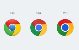
In fact, the designer explained their decision with the following message:
“We simplified the main brand icon by removing the shadows, refining the proportions, and brightening the colors, to align with Google’s more modern brand expression. We also found that placing certain shades of green and red next to each other created an unpleasant color vibration, so we introduced a very subtle gradient to the main icon to mitigate that, making the icon more accessible.”
Sure, there are always finer design elements that can be improved.
But, tell me – did that brighten your day, make any difference to your dependence on Google, or make any sense at all?
It’s one thing for you to have to explain what your logo refresh means.
It’s another thing for you to have to explain what your logo refresh means in order for people to even notice that there was a refresh.
Google could have explained this update with a story, a compelling stat, or something else entirely.
Instead, they bored the life out of everyone except the 3,921 die-hard fans of hexcode-crazy designers.
Takeaway
Does the change in the Chrome logo change anything for you? I’d love to know!
The most effective brand messaging strategy is not to create the messaging that makes the most sense to you. It is creating the brand messaging that makes you, your brand and your products make the most sense to others.
